I spent last weekend doing something slightly ridiculous. I typed out the life cycle of a software bug as a joke, the whole arc from "it works on my machine" to "repeat until retirement," pasted it into Napkin AI, and clicked the little blue spark icon. Twenty seconds later I was staring at a Newton's cradle diagram titled "Software Bugs Impact Production," with pendulum balls labeled Bug Discovery, Developer Denial, Debugging Time, and Feature Breakage. I laughed, got curious, and then lost three hours to this tool.
This review covers everything I found: the full signup flow, the onboarding questions Napkin asks, how visual generation behaves with real input, what the export screen locks behind a paywall, and a proper run through the new Slides beta. I also pulled current pricing straight from Napkin's own site and cross-checked what reviewers on G2, TechCrunch, and Reddit are saying, so nothing here is guesswork.
| Short version: Napkin AI is the fastest way I have found to turn written ideas into clean diagrams, and the free plan is genuinely usable. It also has real limits you should know about before you build a workflow around it. |
What Is Napkin AI?
Napkin AI is a web app that converts written text into editable diagrams, flowcharts, infographics, and now full slide decks. You paste or type content, click a spark icon next to any paragraph, and the tool proposes several visual layouts built from real shapes and text you can restyle, not flat images.
Napkin AI Quick Facts
| Quick Fact | Details |
|---|---|
| Founders | Pramod Sharma and Jerome Scholler, who previously worked together at Osmo |
| Launch | Emerged from stealth on August 7, 2024 with $10 million in funding from Accel and CRV |
| User base | Napkin currently says it has 7M+ users worldwide |
| Main product | Browser-based AI tool for diagrams, flowcharts, mind maps, infographics, data charts, and presentations |
| Mobile support | Existing work can be viewed on mobile, and presentations can be created and edited from a phone; visual generation still requires desktop |
| API | Yes, but it is currently a developer preview rather than a production-ready API |
| Languages | Visuals and presentations can be created in 60+ languages |
| Free plan | 500 AI credits per week |
| Paid plans | Plus from $9 per person/month and Pro from $22 per person/month when billed annually |
| Free exports | Unlimited PNG and PDF export with Napkin branding |
| Paid exports | Unlimited PPT and SVG export on Plus and above |
| Collaboration | Shared Teamspaces, real-time editing, comments, and highlighting |
How I Tested Napkin AI (With Every Step Documented)
I went in as a completely fresh user, screenshotting every screen from the homepage to a finished export. Here is exactly what that journey looks like in 2026.
Step 1: Signing Up Took Under Three Minutes
The homepage leads with "Get visuals from your text" and a Get Napkin Free button. Clicking it brings up three sign-in routes: Google, email, or SSO for company accounts. I went with email, which meant a short form: first name, last name, email, password.
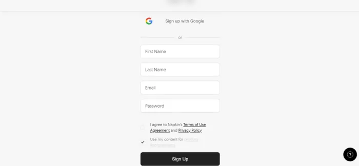
| One detail worth pausing on. The form has two checkboxes. The Terms of Use box starts unticked. The second box, "Use my content for product improvements," comes pre-ticked. If you plan to paste client documents or internal company notes into Napkin, untick it before hitting Sign Up. Napkin's pricing page states it will not use your data to train models if you opt out of data sharing, so this checkbox is where that choice actually happens. |
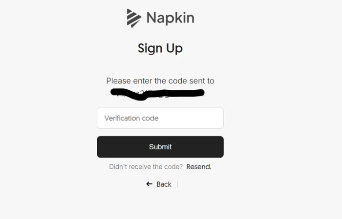
After submitting, a six-digit verification code landed in my inbox within seconds, with a resend link handy.
Step 2: The Onboarding Questions
Napkin greeted me by name with a friendly wave illustration, then walked me through a short multi-step survey shown as progress dots. It asked how I plan to use it (work, personal, school, or other), where my visuals will end up (data and research reports, presentations, internal reports, brainstorming, teaching materials, and more), and how I heard about the product.
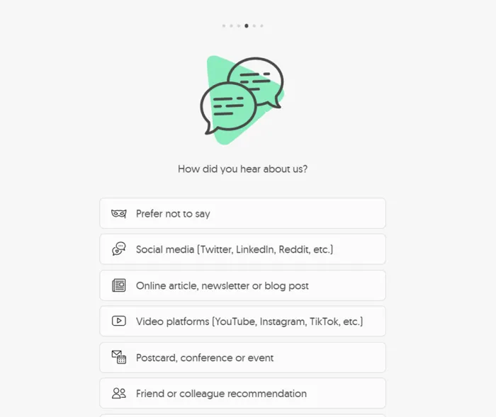
Every single question includes a "Prefer not to say" option, which I genuinely appreciated. Nothing felt invasive, and the whole survey took maybe forty seconds.
Step 3: Generating My First Visual
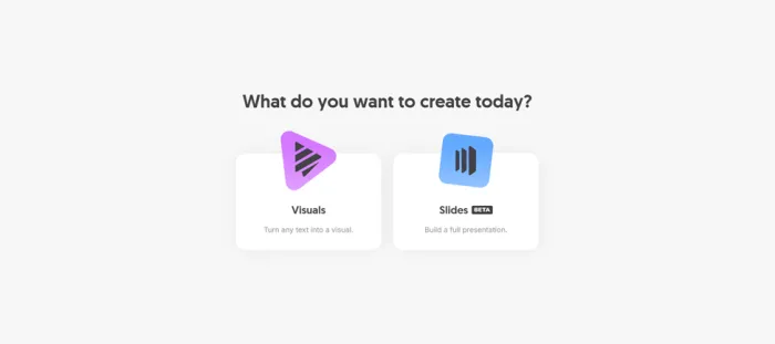
After onboarding, Napkin asks what you want to create today: Visuals or Slides, with Slides carrying a Beta tag. I started with Visuals.
You then pick one of three creation modes:
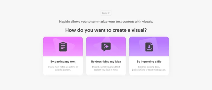
• Paste my text for notes, outlines, or existing content
• Describe my idea where Napkin drafts the text for you first
• Import a file to enhance existing docs, presentations, or posts (the free plan supports unlimited imports of PPT, DOC, PDF, HTML, and MD files)
I chose the paste route and landed in a clean document editor that feels a lot like Notion. This is where I typed my software bug joke. A blue spark icon appeared in the left margin beside the paragraph, and one click sent Napkin to work.
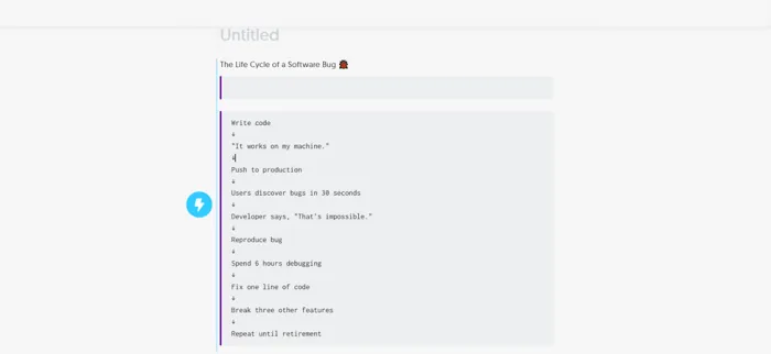
The result honestly surprised me. I fed it comedy and it still extracted a coherent four-stage structure, mapped "users discover bugs in 30 seconds" to a Bug Discovery node, turned the sarcastic developer quote into a Developer Denial stage, and hung the whole thing on a Newton's cradle layout that fit the cause-and-effect theme. It did not just decorate my text. It understood it.
Step 4: Editing and Exporting
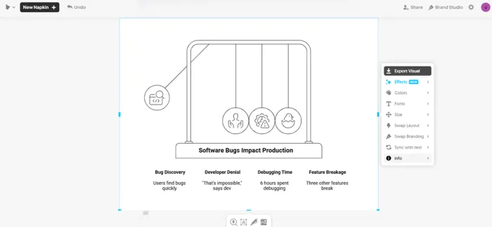
Selecting the visual opens a right-side panel with the full toolkit: Export Visual, Effects (marked as new), Colors, Fonts, Size, Swap Layout, Swap Branding, Sync with Text, and Info. Swap Layout is the one I used most, since it lets you cycle through completely different structures without regenerating. Sync with Text is clever too: edit your original paragraph and the visual updates to match.
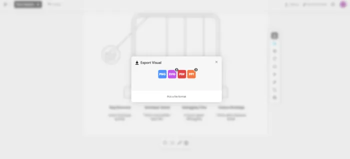
The export dialog offers four formats: PNG, SVG, PDF, and PPT. On my free account, the SVG and PPT icons each carried a small badge reading 3, which matches the pricing page. Free users get unlimited PNG and PDF export, while unlimited SVG and PPT export sits on the Plus plan, so those badges appear to be a small trial allowance before the formats lock. Free exports also carry Napkin branding on the visual itself.
Step 5: Testing the Slides Beta
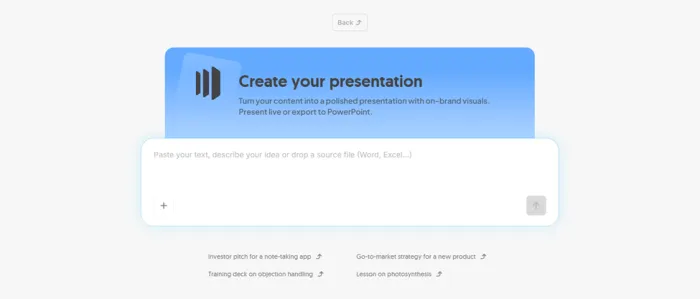
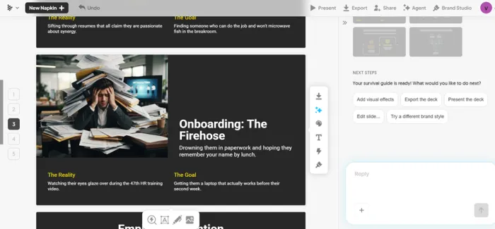
This was the part I was most curious about. The Slides flow opens with a prompt box promising a polished presentation you can present live or export to PowerPoint, plus example chips like "Investor pitch for a note-taking app" and "Lesson on photosynthesis."
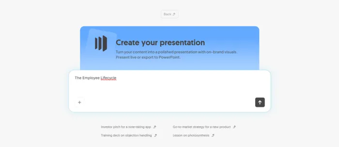
I typed just three words: The Employee Lifecycle. Instead of instantly spitting out a generic deck, Napkin interviewed me.
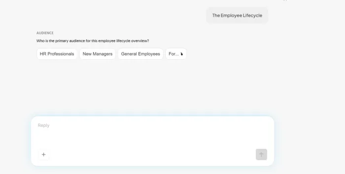
First it asked who the primary audience is, with tappable chips for HR Professionals, New Managers, and General Employees. I picked New Managers and added in my reply that I wanted the tone normal and funny. The next question asked how long the deck should be, offering Quick (5 slides), Standard (8 to 10 slides), or Detailed (12+ slides). Here is the detail that impressed me: the question itself read "How long should this 'normal and funny' guide for new managers be?" It quoted my own words back, proof it was parsing my replies rather than running a fixed script.
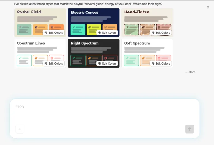
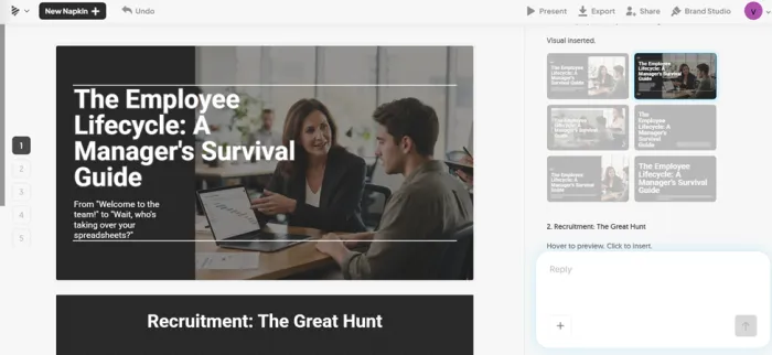
I chose Quick, and Napkin came back with a 5-slide outline it called a survival guide, asking for approval with three suggestion chips: "Looks good, build it!", "Make it funnier", and "Add a slide on Promotion." Those chips anticipated the exact revisions I was considering. The whole exchange felt closer to briefing a junior designer than filling out a form.
What Changed in Napkin AI in 2026?
This matters because Napkin in August 2026 is not the same product many reviews tested in 2024 or 2025. Several of its biggest limitations have changed within the last few months.
| Date | 2026 Update | Why It Matters |
| January 29 | API-token authentication added | Developers can connect Napkin's text-to-visual generation to external workflows |
| February | AI-powered data-chart improvements | Napkin moved beyond mostly conceptual diagrams into stronger data visualization |
| April 14 | Deeper and freeform editing | Individual elements, connectors, and layouts can be manually changed |
| May 27 | Next-generation flowcharts | More styles, layouts, detail, and easier structural editing |
| July 22 | Napkin Slides launched in beta | Napkin can now generate complete presentations rather than only individual visuals |
The April editing update is particularly important. Earlier reviews often describe Napkin as rigid because generated layouts were difficult to break apart. That is no longer a fair description of the current product. I can still get an output that needs cleanup, but the question now is how much cleanup I have to do, not whether Napkin lets me make the change at all.
The same applies to integrations. Napkin now has an API, so saying it has “no public API” is outdated. There is an important catch, though: Napkin still labels the API a developer preview and its API Terms say it is intended for testing and evaluation rather than production or mission-critical applications. That makes it useful for experimentation, but I would not build an important customer-facing workflow around it yet.
Napkin AI Pricing
| Plan | Monthly | Annual (per mo) | AI Credits | What You Get |
|---|---|---|---|---|
| Free | $0 | $0 | 500 per week | Unlimited editing, unlimited file import, unlimited PNG and PDF export, Napkin branding on visuals |
| Plus | $12 | $9 | 10,000 per month | Everything in Free, unlimited PPT and SVG export, watermark removal, 3 brand styles, bold icons, team billing |
| Pro | $30 | $22 | 30,000 per month | Everything in Plus, exclusive designs, unlimited custom branding, font uploads, optional credit top-ups |
| Enterprise | Custom | Custom | Custom | Contact sales |
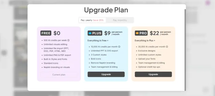
A few pricing details that matter in practice:
• Credits burn per word. Napkin charges roughly 1 credit per word selected for generation. My 60-word bug flow cost about 60 credits per generation attempt, so 500 weekly credits realistically cover a handful of decent-sized visuals plus experimentation.
• Annual billing saves 25 percent, which is how Plus drops from $12 to $9.
• No student or nonprofit discounts exist right now. Napkin points lighter users to the free plan instead.
• Cancel anytime and keep your content. Downgrading preserves everything you made, though editing features tied to paid plans get restricted.
What Do Napkin's Credits Mean in Practice?
Napkin says visual generation uses approximately one AI credit per word selected for generation. Using that approximation, here is what the current limits look like:
| Words Selected Per Generation | Approx. Credits | Free — 500/week | Plus — 10,000/month | Pro — 30,000/month |
| 50 words | ~50 | ~10 generations | ~200 generations | ~600 generations |
| 100 words | ~100 | ~5 generations | ~100 generations | ~300 generations |
| 250 words | ~250 | ~2 generations | ~40 generations | ~120 generations |
| 500 words | ~500 | ~1 generation | ~20 generations | ~60 generations |
These are only rough examples, not guaranteed quotas. Napkin itself describes one credit per selected word as an approximation and says consumption may change for more complex outputs or advanced features. Regenerating several variations also means those credits can disappear much faster than the headline limits suggest.
What People Are Saying
G2 reviewers 4.4 / 5 Verified G2 reviews keep circling two strengths: how fast structured text becomes a usable diagram, and how little training anyone needs to get value. The recurring gripes are limited design flexibility, occasional misreads when the input text is vague, and visual themes that start repeating after heavy use. |
TechCrunch Launch coverage TechCrunch covered Napkin's emergence from stealth in August 2024, describing the spark icon workflow that turns canvas paragraphs into customizable flowcharts, graphs, and Venn diagrams. It also noted that visuals are generated inside Napkin's own system, so users do not need to worry about rights on the output. |
Reddit Community sentiment Roundups of Reddit threads describe a consistent trade-off: people love the speed and dislike the rigidity. The structured design grid keeps output clean but blocks freeform additions like a single custom arrow, and multiple users call Napkin desktop-first since phone editing gets frustrating. |
What Worked and What Did Not
| Worked Well | Fell Short |
|---|---|
| Generation speed, roughly 20 to 30 seconds per visual | Napkin watermark on every free export |
| Output is editable shapes, not a flat image | No freeform drawing, everything snaps to the grid |
| Understood messy, even joking input surprisingly well | Vague or unstructured text produces generic results |
| Free PNG and PDF export with no caps | Unlimited SVG and PPT export requires Plus |
| Slides beta asks smart clarifying questions | No mobile app and no public API |
| Sync with Text keeps visuals matched to edits | Credit math takes effort to predict |
Napkin AI vs Popular Alternatives
| Tool | Where It Beats Napkin | Where Napkin Wins |
|---|---|---|
| Canva | Massive template library and full design suite | Much faster from raw text to finished diagram |
| Adobe Express | Deeper editing tools and image generation | Purpose-built text-to-visual logic, quicker output |
| Lucidchart | Precise manual control for technical diagrams | Zero setup, no dragging shapes around |
These tools solve different problems. Napkin is not trying to replace a design suite. It wants to delete the hour you spend turning a paragraph into a flowchart, and at that single job it is the best I have used.
Who Should Use Napkin AI
| Great Fit | Look Elsewhere If |
|---|---|
| Content marketers illustrating blog posts, managers turning meeting notes into process diagrams, educators building teaching visuals, consultants who need presentable graphics without a designer, and anyone drafting internal reports. | You need pixel-level creative control, you work primarily from a phone, your workflow demands API integrations, or your source text is loose brainstorming with no real structure. |
Final Verdict: Worth It, With One Caveat
After a weekend of genuine use, here is where I landed. Napkin AI does one job better than anything else I have tried: it takes text I already wrote and hands back a diagram I am not embarrassed to put in front of people. The bug life cycle test sold me. I gave it a joke and it still found sensible structure, grouped the right steps, and picked a layout that matched the meaning.
I am keeping the free plan for now. The 500 weekly credits cover my real usage, and PNG export handles blog images fine. If I were sending client deliverables, the watermark would push me to Plus within a week, and at $9 a month on annual billing that is an easy call.
Two things hold back a higher score. The layout system is rigid, so the one time I wanted a custom arrow outside the grid, the tool simply had no answer. And the Slides beta, impressive as its conversational briefing is, still gates PowerPoint export behind Plus, which is exactly the format most people need slides in.
| My advice in one line: sign up free today, run your own weird test paragraph through it, and upgrade only when the watermark or PPT export starts costing you actual time. |