Most blogging platforms try to sell you the moon before you have even decided what to write. UploadBlog.com takes a different route. The homepage opens like a digital magazine, drops you straight into the content, and lets the work speak first. If you have ever wondered whether the site is right for your reading habits, your writing ambitions, or your business promotion plans, this walkthrough breaks down exactly what greets you the moment you arrive.
First Impressions: A Magazine, Not a Sales Pitch
The header carries a single, plain promise: "Upload Your Blog Here." There is no flashy hero banner, no aggressive call to action, no countdown timer pushing a paid tier. Instead, a Hot News strip runs across the top with recent headlines, the logo sits modestly to the left, and a clean search bar opens up the full archive.
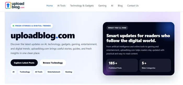
Visitors looking for fresh reads scroll into a grid of thumbnails within two seconds. Visitors looking to publish find the Write for Us link parked in the primary menu, ready when they are. That restraint is the point. The platform positions itself as a destination for readers and a workspace for writers, not a tool for either to be marketed at.
The Top Menu: Eight Doors Into the Site
Navigation is where many publishing platforms either overcrowd or underdeliver. UploadBlog.com lands somewhere comfortable, with eight items that cover both reading paths and contributor paths. The first table below maps each menu link to the kind of content it surfaces.
| Menu Item | What It Opens |
|---|---|
| Home | • Returns to the main feed • Latest grid of recent posts • Hot News strip up top |
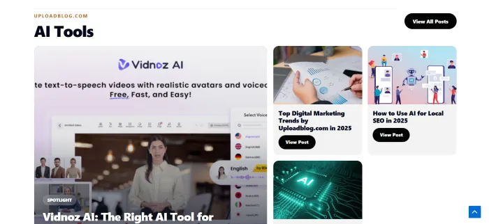
| AI Tools | • Tool reviews • Comparisons and roundups • Sub-category of Technology |
| AI | • Broader AI stories • Industry news and model updates • Trend pieces |
| Technology & Gadgets | • Hardware and software • How-to guides • Parent category for AI Tools |
| Home & DIY | • Renovation tips • Home services content • Lifestyle upgrades |
| Mobiles | • Phone reviews • Mobile tips and tricks • Smartphone news |
| Gaming | • Game reviews • No-code maker stories • Entertainment posts |
| Laptops | • Laptop guides • Side-by-side comparisons • Buying advice |
Outside the main row, three more links matter for visitors with intent: About Us, Write for Us, and Contact Us. These cluster on the right of the menu and serve as the on-ramp for anyone moving from reader to contributor.
What Actually Sits on the Homepage
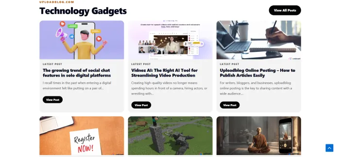
Scroll past the menu and the layout settles into a familiar news-magazine pattern. Recent posts arrive first, each presented as a card with a thumbnail, a category tag, a short title, the author handle, and a publication date. The signature look comes from the News Magazine X theme, and it carries forward across every post tile on the page.
A quick scan of the live feed shows the breadth of what gets published. The next table samples real titles taken straight from the visible homepage.
| Sample Post Title | Category Tag |
|---|---|
| How Commercial Pressure Cleaning Supports Business Properties | • Blog |
| How to Cook Chicken Mignon in Air Fryer Australia | • Food |
| CometAPI Integrates Nano Banana 2, Gemini 3.1 Flash, GPT-5.3 Codex | • Blog |
| Why the Smartest Companies Optimize Before They Expand | • Blog |
| Material Selection by The Tech Pack Designer | • Technology & Innovation |
| Digital Transformation in Schools: Implementation Plan | • Education |
| Making Games Fun With a No-Code Game Maker | • Gaming |
| Top Digital Marketing Trends by Uploadblog.com | • AI Tools |
That mix tells you something important. The site is not niched down. It is a general-interest publishing space where service businesses, AI developers, cooking enthusiasts, school administrators, and game creators all share the same front page.
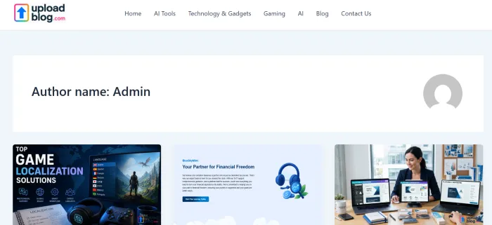
The Author Pattern
Every post on the visible homepage credits Admin as the writer. That hints at a centralized editorial flow where submitted articles get republished under a house account rather than under individual bylines. For readers, that means the voice across posts may vary even though the byline does not. For contributors, that means recognition arrives through traffic and engagement, not name display.
Pagination and Depth
The footer of the homepage exposes a useful data point. The archive currently stretches across nineteen pages, with new entries pushing older ones down the stack. With roughly a dozen posts per page, the live library sits somewhere in the range of two hundred plus articles. For a content discovery experience, that depth matters. Readers can dig past the freshest stories and into evergreen guides on topics like blog post formatting, WordPress uploading, LinkedIn publishing, and Instagram blog promotion.
Reader Path Versus Writer Path
The same homepage serves two crowds at once. The next table separates how the homepage works for five common visitor types, so you can see your own path more clearly.
| Visitor Type | How They Use the Homepage |
|---|---|
| Casual readers | • Scan Hot News strip • Tap category tags • Click thumbnails for quick reads |
| Topic researchers | • Use the search bar • Filter by category • Page through older entries |
| Independent writers | • Locate Write for Us • Study post formats • Check category fit before pitching |
| Small business owners | • Read promotion guides • Gauge audience activity • Plan submission topics |
| SEO marketers | • Study title patterns • Inspect slug structure • Track which tags get fresh posts |
Categories That Stretch Beyond the Top Menu
The eight items in the top navigation give a partial picture. Browsing post tags reveals a deeper category list that includes Food, Education, Travel and Culture, Business and Finance, Marketing, Fashion, Fitness and Nutrition, Lifestyle and Wellness, Technology and Innovation, How-To Guides, Guide, and Service. That breadth signals the platform is open to almost any topic with a clear, useful angle, not just tech and AI despite what the visible menu suggests.

Design Notes: What Works and What Slows Down
Anyone evaluating the homepage as a reading experience should weigh both sides. The table below lays out the strengths against the trade-offs in plain pointers.
| Strengths | Trade-offs |
|---|---|
• Clean magazine grid that scans fast • Hot News strip surfaces recent posts • Category tag visible on every tile | • Generic theme with low brand distinction • Single Admin byline reduces author trust • Top menu does not reflect the full category set |
• Search bar sits in the header • Mobile-friendly responsive layout • Free contributor signup pathway | • No visible personalization or recommendations • Image quality varies post to post • Editorial standards are not on the main page |
What the Homepage Tells You About the Platform Identity
Pull back and three signals are clear. First, the site treats publishing as plural, with multiple categories, multiple post types, and a multi-author submission flow built into the navigation. Second, the homepage prioritizes content density over visual showmanship, which favors readers who like to scan and writers who want their work surfaced quickly. Third, the platform positions itself as a low-friction alternative to setting up a self-hosted blog, with the Write for Us page serving as the on-ramp.
Who Should Bookmark It
The next table answers the question every new visitor really has: is this site for me? Match your intent to the row that fits and the right side tells you what the homepage gives you in return.
| If You Are... | The Homepage Helps By... |
|---|---|
| A new writer with no audience | • Offering instant visibility on a live feed • Skipping setup, hosting, and theme work |
| A business owner with thin SEO | • Hosting your content under an established domain • Surfacing posts in tagged category feeds |
| A reader bored of niche-only sites | • Mixing tech, food, education, lifestyle • Showing variety on a single scroll |
| A content marketer testing topics | • Showing which categories see fresh activity • Indexing how titles and tags get framed |
| A student researching trends | • Providing free, indexed how-to and trend posts • Pulling up older guides through pagination |
Where It Falls Short
The homepage does its job for discovery, but a few gaps are worth noting before any contributor or reader commits time. Authorship transparency is light. There is no homepage indicator of post performance such as view counts, social shares, or comment counts. Editorial guidelines, when they exist, sit one click away rather than on the main page. And the visual language stays close to the default News Magazine X theme, which means the homepage feels familiar rather than memorable.

Final Take
UploadBlog.com homepage is not trying to dazzle. It is trying to deliver. Readers get a steady drip of mixed-topic content, organized into clear categories and tagged consistently. Writers get a simple front door to a multi-category platform that already has reach and structure in place. If the goal is to read widely or publish quickly without managing hosting, themes, or plugins, the homepage opens that path within the first scroll.
For anyone weighing where to spend reading time or publishing effort, the homepage gives enough signal in three minutes to make the call. That, on its own, is a small but meaningful design win.